
Hi! I'm Amanda Ward
Data Analyst | Business Analyst | Data Storyteller
Research-Driven Business Analyst Turned Data Analyst
Excel, Tableau, SQL, Python, R
Reading • Writing • Puzzling
📍Remote • Bloomfield, NJ • NYC Metro Area
Technical Skills


SQL
Tableau
Excel
Python
R
Project Management
Projects
Exploring World Bank Loan Data with SQL
SQL | Exploratory Data Analysis
◾ Data-mined 1.4M real bank transactions to find financial outliers, patterns, & trends
◾ Used SQL clauses such as SELECT, WHERE, FROM, GROUP BY, AVG, MIN/MAX, SUM, AND, etc
◾ Created written report highlighting findings
.

Decoding Hospital Data with SQL
SQL| Exploratory Data Analysis
◾ Explored patterns in early readmission, length of stay, and diagnosis codes in MySQL
◾ Utilized CTEs, CASE WHEN, and window functions
◾ Real data from over 101,000 hospital patients
.

Evaluating School Success with Tableau
Tableau | Data Visualization
◾ Created dashboard evaluating 1,800 different schools' performance across 100's of features
◾ Used Scatter Plots, KPI's, Bar Plots, & Area charts to show performance differences
◾ Presented dashboard to stakeholders via recorded video
.

Uncovering Goodreads Choice Award Trends with Python
Python| Exploratory Data Analysis
◾ Explored voting trends, genre engagement, and award category shifts using pandas and custom visualization functions
◾ Identified outliers and reader behavior patterns with quantile filtering, correlation matrices, and pairplots
◾ Real data from over 5,000 Goodreads Choice Award finalists across 14 years
.

Predicting Employee Attrition with R
R| HR Analytics & Statistical Modeling
◾ Investigated who leaves, why they leave, and which factors matter most using exploratory and inferential analysis
◾ Leveraged correlation matrices, t-tests, chi-square analysis, and multivariate regression modeling
◾Identified workload intensity and early-career risk as key drivers of employee turnover
.

Analyzing NBA Data with Tableau
Tableau | Dashboarding
◾ Analyzed the 2022 NBA season statistics
◾ Created Stacked Bar Charts, Heatmaps, Treemaps & Bubble Charts
◾ Built a Tableau story & shared via written report
.

Analyzing DoorDash Marketing Data with Excel
Excel | Exploratory Data Analysis
◾ Real world-marketing campaign data
◾ Using only Excel for analysis and data visualization
◾ Utilized VLOOKUPS, Pivot Tables, Scatter Plots, & Bar Charts
◾ Provided a comprehensive write up to help the marketing team on their next campaign
.

About Me

Welcome to my portfolio!I’m Amanda, a former Business Analyst making the leap into data analytics. After three years in the software and services industry, I realized what I enjoyed most was digging into data, uncovering insights, and helping teams make smarter decisions. That curiosity led me to start building my skills through hands-on projects and formal training using tools like:- Excel
- SQL
- Tableau
- Pyton
- RAnd now I’m looking for my next opportunity in data analytics! Ideally, I hope to land somewhere I can keep learning, solve meaningful problems, and help turn complex data into clear, actionable stories. I bring a strong analytical mindset, an eye for detail, and a genuine love for making sense of messy information.When I’m not working with data, you can usually find me deep into a great book, out at a live show, or hanging out with my fiancé and our very opinionated cat, Rilo.Thanks so much for stopping by! If you’re currently hiring, or just want to connect and chat about data, I’d love to hear from you. You can reach me on LinkedIn or by email at [email protected].
Previous Experience
Business Analyst
Wolters Kluwer, May 2022 - May 2025As a Business Analyst, I supported a $4M–$8M product revenue growth by driving data-informed decisions, expanding product offerings, and improving internal processes.◾ Helped launch 6 new offerings through research and data analysis, contributing to $2M in revenue growth.
◾ Created data visualizations for internal teams and clients to support faster, more informed decision-making.
◾ Improved software accuracy and user experience, reducing rejections by 55% over 2.5 years.
◾ Managed 120+ research requests annually across 51 jurisdictions, ensuring regulatory compliance and data integrity.Luxury Hospitality Industry Experience
◾Auberge Resorts Collection, Global Sales Coordinator, October 2019 - April 2020
◾Las Ventanas al Paraíso, A Rosewood Resort, Sales & Marketing Coordinator, November 2018 - October 2019
◾Langham Hospitality Group, Global Sales Coordinator, March 2015 - November 2018
Visualizing What Matters in Education:
A Tableau Case Study
With nearly a million students across the state, education leaders in Massachusetts face a complex challenge in ensuring equitable support for every student.When the Superintendent of the Department of Education tasked me with identifying the schools most in need of intervention, I created a Tableau dashboard to really dive into the data and help uncover patterns in student success. Using a publicly available dataset from the Massachusetts Department of Education (found here), I focused on three key areas:◾Graduation rates
◾College attendance
◾4th-grade math proficiencyWhen taken together, these metrics reveal actionable insights that can help direct funding and improve education policies.Feel free to explore the dashboard yourself here. It’s fully interactive and available to dive into.If you'd like to hear more context behind the data, I also recorded a walkthrough for the Board which you can watch here.
Questions I Explored
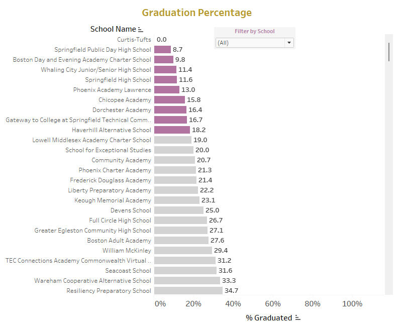
1. Graduation Rates: Where Can Early Interventions Have the Biggest Impact?One of the Superintendent’s primary concerns was identifying which high schools have the lowest graduation rates. I started by building a bar chart that highlights the 10 schools with the lowest rates across the state.To make the findings clearer:◾Null values were filtered out to ensure accurate representation.
◾Color coding was used to visually emphasize schools in most need of support.
◾Labels were added to each bar to help highlight the specific graduation rates.Key Insight: Graduation rates are an early warning sign. By investing in struggling schools, through academic support, staff training, or funding programs, leaders can help more students stay on track.
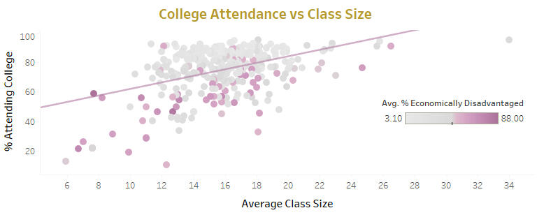
2. College Attendance and Class Size: What’s Really Driving Outcomes?Next, I explored whether smaller class sizes lead to better college attendance rates. Using a scatter plot, I compared average class size to the percentage of students attending college post-graduation.The initial results were surprising. There was no clear linear pattern in the scatter plot. The points formed more of a square shape, suggesting little correlation between class size and college attendance. A closer look at the R² value confirmed this: class size accounted for only 19% of the variation in college attendance rates.To dig even deeper, I color-coded each point by the percentage of economically disadvantaged students, and that’s where the story changed.Key Insight: Schools with lower college attendance often serve higher numbers of economically disadvantaged students. Financial and social support may be the key to post-secondary success. Efforts to create mentorship programs, college counseling, and scholarship opportunities would likely be much more impactful than reducing classroom sizes.
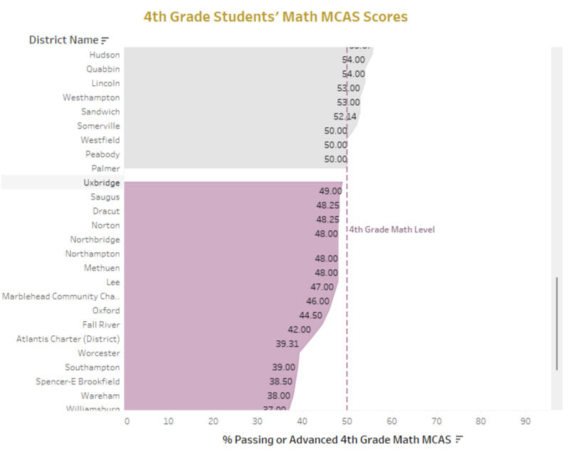
3. 4th Grade Math Proficiency: Can Early Skills Predict Long-Term Success?Finally, the Superintendent believes that strong math skills at an early age set students up for long-term success. To highlight early academic performance, I focused on 4th-grade math proficiency scores on the MCAS exam. I visualized district performance using an area chart, adding a 50% reference line to separate higher and lower-performing schools.To help decision-makers quickly grasp the results, districts were color-coded as “Passing” or “Needs Work.” This layout clearly shows which areas may benefit from targeted curriculum changes or resource investment.Key Insight: Foundational math skills set students up for future academic achievement. Strengthening support in elementary schools that are underperforming in this area may have long-lasting impacts on students later on.
From Data to Action
This project highlights how accessible, well-structured data can uncover areas where school systems need the most support:◾Graduation rates help identify high schools that need targeted intervention.
◾College attendance is shaped more by economic status than by class size.
◾Math proficiency in early grades predicts long-term outcomes and can help us target schools where early interventions will have the biggest impact.As a data analyst, I’m passionate about transforming raw information into tools that drive real-world decisions. Whether working on public sector challenges or business intelligence, I love helping teams unlock the story behind the numbers.If you're interested in learning more about this dashboard or collaborating on a project, I would love to connect on LinkedIn.This project was completed as part of the Data Analytics Accelerator Bootcamp for educational purposes only.